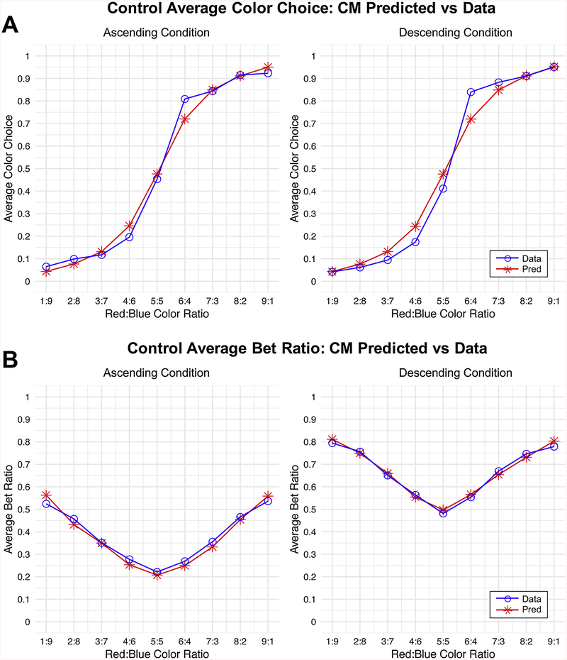
Fig. 2.
Comparison of Posterior Predictive Simulations versus Actual Average Choices.
Posterior predictive simulations generated from the best fitting model (CM with log valuation function; Model 12 in the Supplementary Text). Simulations from the model were generated for each individual after fitting the model, conditional on their actual choices. Resulting individual level predictions were then averaged across participants within groups and plotted against the actual behavioral choices averaged across participants within groups. Note that these graphs depict only healthy control data, though results were consistent across groups. We refer the reader to S2 and S3 Tables for comparison of posterior predictive simulations across models and groups. (A) Simulations versus actual behavioral data for color choices. Note that a choice of blue was coded as 0, and a choice of red was coded as 1. Thus, averages close to zero indicate more choices of blue, and those closer to 1 indicate more choices of red. (B) Simulations versus actual behavioral data for bet choices. The y-axis here now represents the average betting ratio that was chosen versus predicted. Note that while the shapes for the ascending and descending cases are similar, the descending graph is shifted upward relative to the ascending graph—this difference indicates impulsivity and is captured by β in the CM model.

