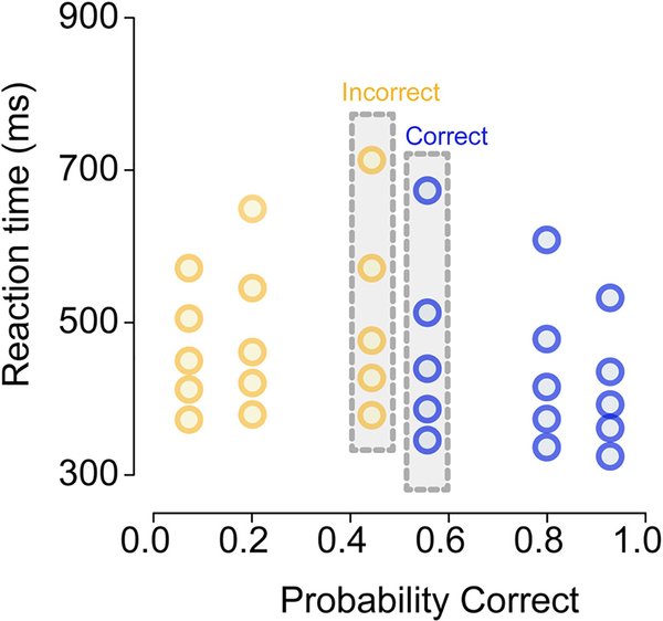
Fig. 2.
A quantile probability (QP) plot of choice and RT data from a hypothetical decision-making experiment with three levels of stimulus difficulty. The three difficulty levels are represented as vertical columns mirrored around the midpoint of the x-axis (0.5). In this example, the lowest accuracy condition had ~55% correct responses, so the RTs for correct responses in this condition are located at 0.55 on the x-axis and the corresponding RTs for error responses are located at 1 − 0.55 = 0.45 on the x-axis; these two RT distributions are highlighted in gray bars. For each RT distribution we plot along the y-axis the 10th, 30th, 50th, 70th, 90th percentiles (i.e., 0.1, 0.3, 0.5, 0.7, 0.9 quantiles), separately for correct and error responses in each of the three difficulty levels. For clarity, correct responses are shown in blue and error responses are shown in yellow. (For interpretation of the references to color in this figure legend, the reader is referred to the web version of this article.)

