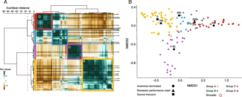
Fig. 2.
Analysis of the bioreactor’s community clustering, using the relative abundance of the bacteria. a clustering heatmap of bacteria based on pairwise cross correlations for the six time points (matrix values are Rho values). Color scales mark high positive correlation in green and negative correlation in brown. The row and column dendrograms are identical (consisting of the genomes). The row dendrogram shows the calculated distance between the clusters with a dashed red line marking the split into clusters. Colored squares as well as bars to the left of the heat map show relative abundance-based grouping: Yellow indicates Group A; blue, Group B; purple, Group C; and red, Group D. A black star to the right of the heatmap marks the anammox bacterium (Brocadia). b Two-dimensional nMDS projection of bacteria and time points, showing the association of the bacteria (and relative abundance groups to certain time points). Each colored dot represents the centroid of a bacterium, with colors matching the relative abundance group. Black marks represent the centroid of the time points, while the shape represents the state of the bioreactor: circle indicates anammox dominated; triangle, bioreactor crash (either mechanical or biological; and square, time zero. The location of Brocadia is marked with a red star

