
Figure 1.
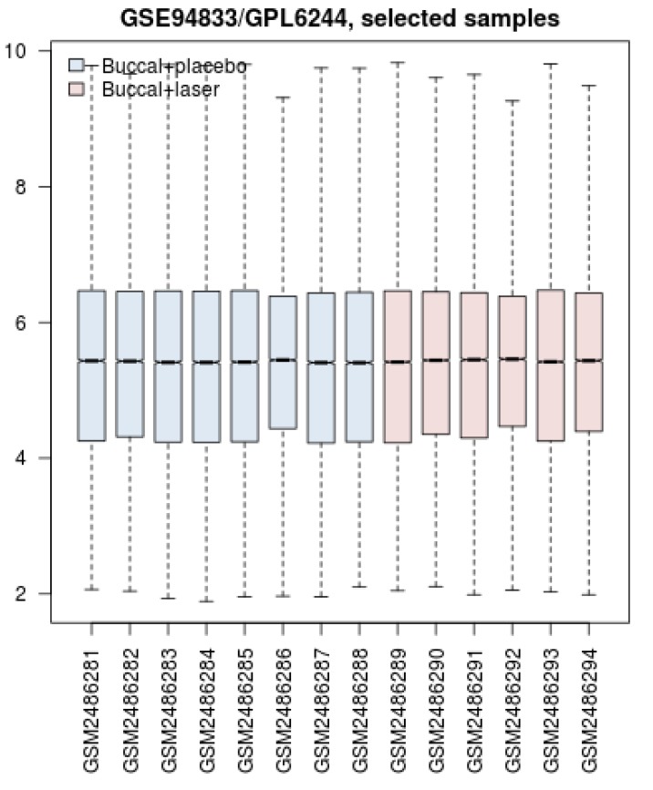
Box Plot Comparison Between the Samples. Blue and red colors refer to the gene expression profiles of the control group (placebo applied) and the laser-treated group respectively. The distribution of gene expression amounts for the 4 quarters of genes is illustrated.