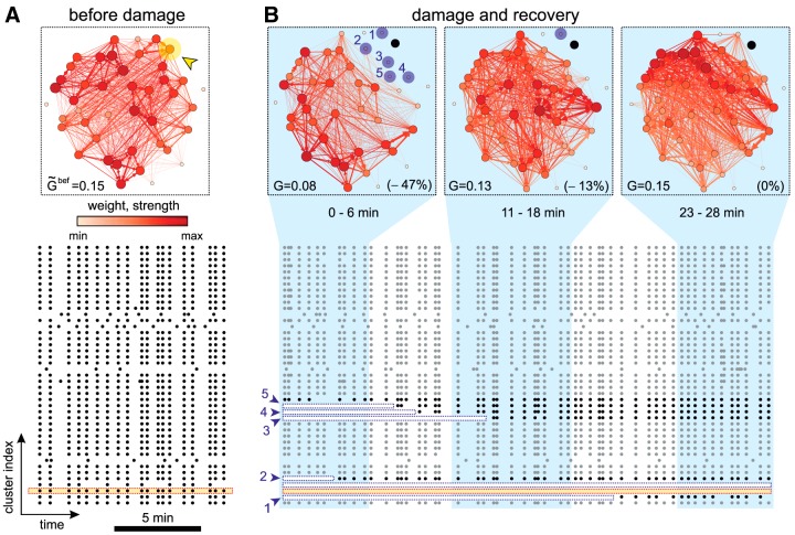
Figure 2.
Network evolution during recovery. A, Network effective connectivity and raster plot of activity before damage. The effective connectivity is computed on the full, 30 min duration of the recording. Nodes and links are color coded according to their strength and weight, respectively. The darker the color, the higher the value. The yellow arrowhead marks the targeted cluster. provides the global efficiency before damage. The bottom raster plot shows the 10 min before damage, with the yellow band highlighting the cluster to be ablated. Black dots are activations. B, Effective connectivity evolution and raster plot after damage. The effective connectivity networks were computed in ∼6 min time windows. The ablated cluster is marked in black. Clusters in blue are those that became silent just after damage but recovered afterward, with the numbers indicating their location in the bottom raster plot. G provides the global efficiency, and its relative change with respect to is shown in brackets. In the raster plot, the ablated cluster is shown with a yellow band; the initially silent clusters are shown with a white band. One of these clusters never recovered and the band encompasses the full duration of the raster plot. Gray dots are activations in clusters that did not substantially change activity after damage. Black dots are activations in affected clusters.

