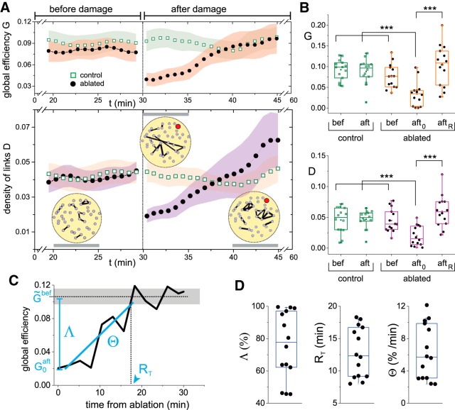
Figure 3.
Variation of the global efficiency and the density of links on damage. A, top plot, Time evolution of the global efficiency G for control (green) and ablated (black) cultures, before and after damage. Bottom plot, Corresponding density of links D. The yellow panels provide representative effective networks of the experiment shown in Figure 2, are computed over ∼5-min time windows (gray horizontal bars) and are thresholded to show the 5% links with the highest weight. The ablated cluster is marked in red. The networks illustrate the important changes in the distribution of links’ weights along the recovery process. In both plots, data were averaged over 14 cultures and the shadings show SD. For clarity, only the last 10 min before damage and the first 15 min after damage are shown. B, Box plots of the distribution of G (top) and D (bottom) values for the 14 cultures at different experimental conditions, comparing controls before and after damage with ablated cultures before damage, the first 5 min after ablation (aft0) and the last 15 min of the recording and that correspond to the recovered state (aftR). For both G and D, significance (***p < 0.001, one-way ANOVA) is only observed between the condition just after damage and the rest of conditions. C, Evolution of the global efficiency for a representative individual experiment to spotlight the definitions of the global efficiency loss Λ, recovery time RT, and recovery rate Θ. and are, respectively, the global efficiencies before damage (dotted line for average, gray shading for SD) and just after damage. D, Distributions of Λ, RT, and Θ for all 14 experimental realizations. All box plots span from the median to the first and third quartiles, and whiskers span from the 10th to 90th percentile.

