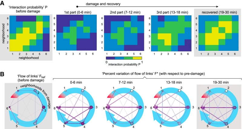
Figure 5.
Network communication during recovery. A, Interaction probability P among all pairs of neighborhoods. The brighter the color, the higher the formation of effective links between and within neighborhoods. Data were computed for each culture and then averaged over the 14 studied cultures. The left panel shows the neighbors’ interaction before damage, with data averaged over 30 min. The three central panels show the action of damage and subsequent recovery, with each panel corresponding to ∼6-min window intervals for analysis. The last panel shows the stationary recovery, with data averaged over a broader window of ∼12 min. B, Corresponding representation of the flow of links (before damage) and the percentage variation of flow of links F* (rest of panels, calculated with respect to the predamage scenario). The blue curved arrow and the numbers indicate the distance from damage in terms of neighborhoods. Damage locus is symbolized as a red band. Before damage, purple arrows depict the communication flow between neighborhoods. After damage, the arrows depict the level of formation of new effective links between neighborhoods with respect to predamage. Arrows’ thickness and color intensity are coded according to the values of F or F*. Nodes’ color is coded according to the relative strength (weighted sum of incoming and outgoing links) of the neighborhood.

