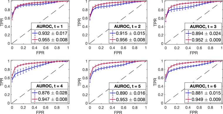
Figure 3.
Model performance evaluation using ROC curves (in silico study). The mean ROC curve corresponding to DynGLasso (red line) is closer to the upper left corner than the model GLasso (blue line), indicating a higher accuracy in the network estimation. The mean ROC curves are estimated using 20 synthetic time-series datasets, and the error bars correspond to their standard deviation. The estimated AUROC (in the legend) shows that the performance of DynGLasso is higher than GLasso and the low standard deviation of AUROC indicates a higher robustness of DynGLasso predictions.

