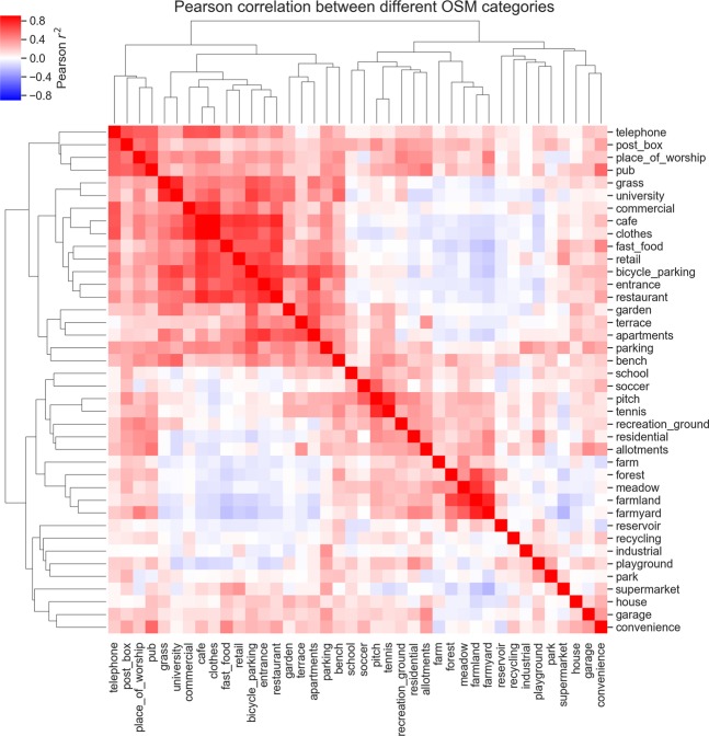
Figure 2.
Clustermap showing the Pearson correlation of the distribution of different OSM categories over all Oxfordshire wards. The heatmap shows the correlation between the number of points of interest tagged as every OSM category in this study. The trees show how OSM categories cluster according to their correlation. For example, OSM categories such as farm, farmland, farmyard form a cluster, indicating that they often appear in the same wards, while not being as correlated to categories such as cafe and fast food.

