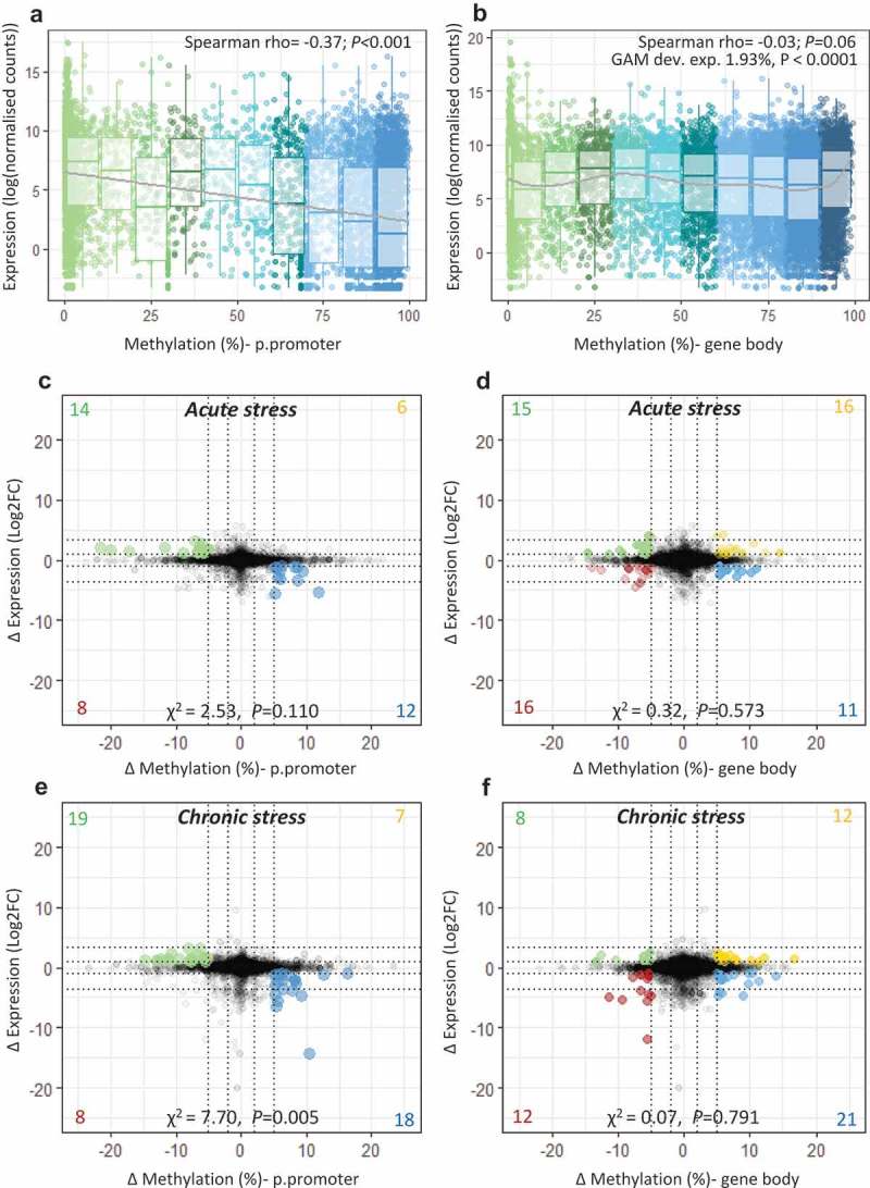
Figure 3.

Integration of transcriptome and methylome. Scatterplot and boxplot displaying mean gene expression and mean DNA methylation for (a) putative promoters and (b) gene bodies in control fish (n = 8), with lines representing a linear trend (A) and a smoothed GAM curve (B). (c-f) Starburst plots displaying the effect of stress on the transcriptome and the methylome. For each type of stress relative to the control group, change in gene expression (log2fold change) is plotted against change in DNA methylation (ΔM) for (c;e) putative promoters and (d;f) gene bodies. Highlighted dots denote genes with ΔM > 5% and |FC |> 2; yellow = hyper-methylated/up-regulated, blue = hyper-methylated/down-regulated, green = hypo-methylated/up-regulated, red = hypo-methylated/down-regulated. A full list of highlighted genes is provided in Table S5-S6.
