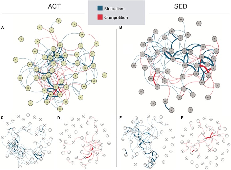
FIGURE 2.
Network representations in (A) active (ACT) and (B) sedentary (SED) populations. This network is composed by nodes (circles representing the bacteria abundances named in Table 1) and edges (lines representing the statistical correlation between nodes). Blue edges represent positive relationships, while red edges represent negative relationships. The spatial position of the nodes was chosen by the Fruchterman-Reingold algorithm to draw close those nodes with stronger and/or more connections while placing with low centrality at the perifery. The network is split into mutualism and competitiveness networks [(C,D) for ACT, and (E,F) for SED, respectively].

