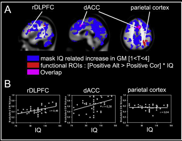
Fig. 5.

(A) Cortical map showing: (1) a blue colored mask that identifies all cortical areas that showed a significant correlation between grey matter volume and IQ, (2) a red colored mask showing rDPLFC, dACC and parietal cortex from the functional regression analyses, and (3) a purple mask showing the overlap between masks 1 and 2. (B) Representation of the correlation between IQ and average grey matter volumes for the three regions of interest. (For interpretation of the references to color in this figure legend, the reader is referred to the web version of the article.)
