
Figure 3.
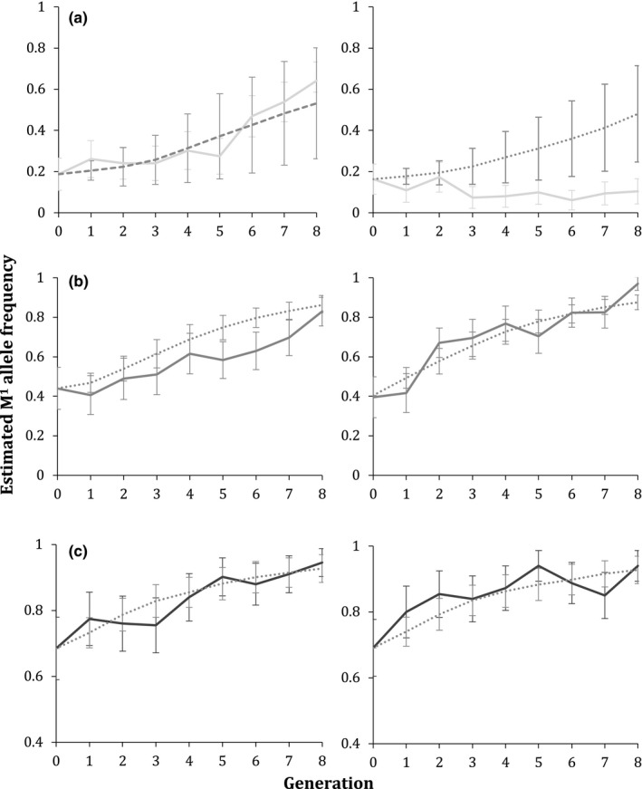
Experimental M1 element increases resemble model results. Solid lines show two replicates from the (a) LA, (b) TX, and (c) TN populations, and dotted/dashed lines represent the model that is the best visual fit to the data. For each, Replicate 1 is on the left, and Replicate 2 is on the right. Dotted lines represent models with heterozygote fitness cost of 0.3, while dashed lines represent models without these costs