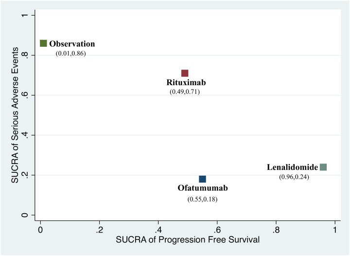
Fig 6. Scatter plot presenting the ranking of progression-free survival and serious adverse events.
The more close to right top half means better prolongation of PFS and lower incidence of SAE. X-axis represents SUCRA value of PFS; Y-axis presents SUCRA value of serious adverse events. Both of the values were showed in brackets.

