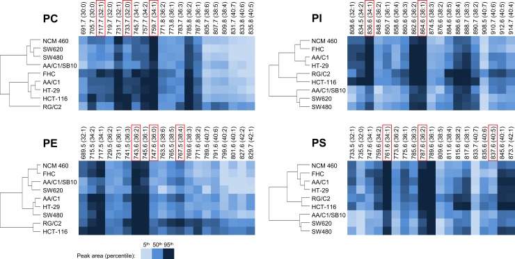
Fig 1. Similarity of cell lines based on the amount of specific PL species.
Peak areas summarized according to lipid species MWs (shown above) as percentiles in each PL class. Carbon and DB numbers for respective MW species are shown in parentheses. Cell lines were grouped based on the results of cluster analysis (left). The color intensity reflects the abundance of the respective PL species in cell line (see the color key in the Figure). PLs with the largest differences among cell lines (the most discriminating) are highlighted in red frames.

