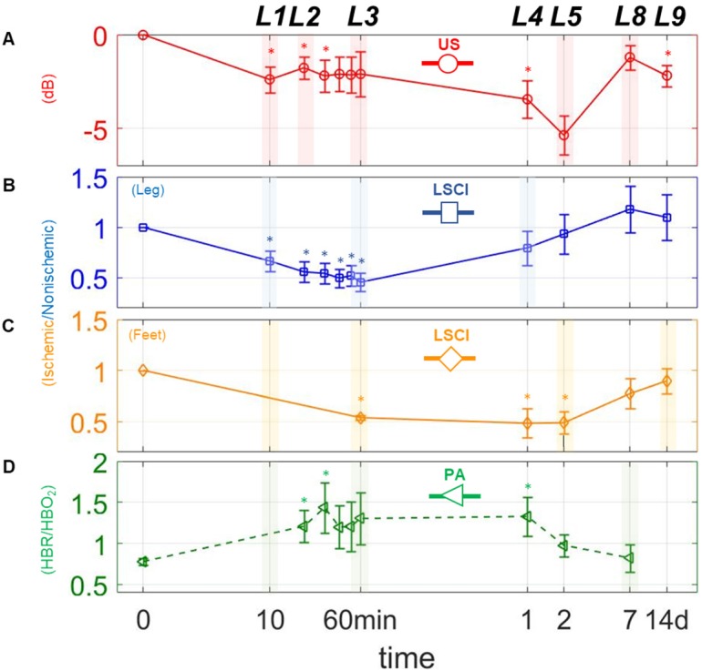
Figure 3.
Changes in perfusion and hypoxia over a logarithmic timeline. Points marked (◦) and (□) are for perfusion estimates using US and LSCI, respectively. Points marked (□) indicate the ratio of deoxygenated to oxygenated hemoglobin (HbR/HbO2) as measured via PA. (A)-(D), represents plots of each measure individually. The mark (∗) above each point indicates a statistically significant (p < 0.05) difference from the preligation state. L above each time point indicates a landmark.

