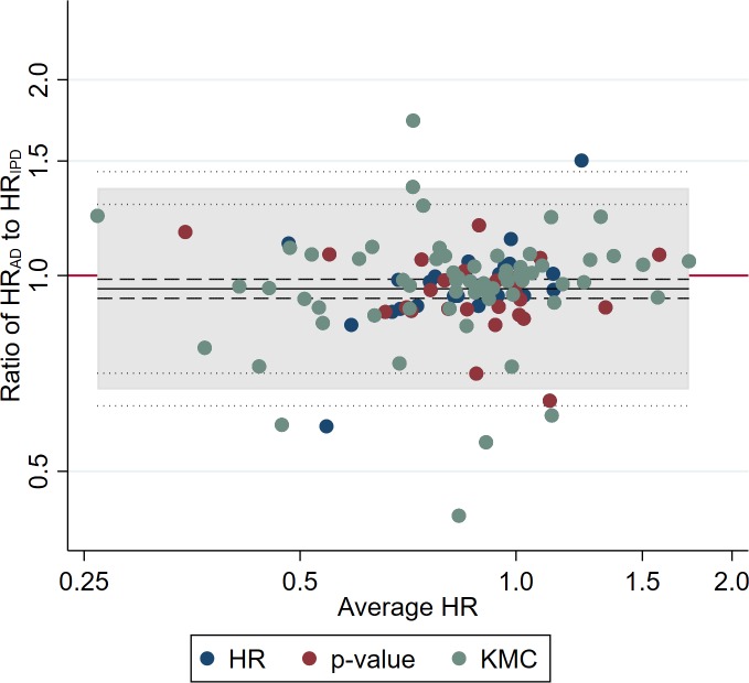
Fig 1. Comparison of trial HRs from AD versus IPD.
Bland–Altman plot showing how the ratio of the HR from AD to the HR from IPD varies with the average HR (i.e., the geometric mean of the 2 HR estimates). The red horizontal line represents no difference (i.e., a ratio of 1). The shaded area represents the 95% Bland–Altman limits of agreement. Dashed and dotted lines represent statistical precision around the average ratio and the limits of agreement, respectively. Individual data points are distinguished by whether the AD estimate was derived directly from a reported HR, indirectly from a reported p-value and associated information, or indirectly from a Kaplan–Meier curve [6]. AD, aggregate data; HR, hazard ratio; IPD, individual participant data; KMC, Kaplan–Meier curve.

