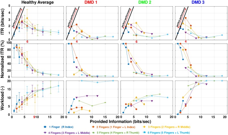
Fig 3. The results for all participants.
The top four graphs show the raw values of ITR in bits/sec. The middle plots show the normalized ITR and the bottom the perceived workload of all the subjects. For the healthy group, average mean and standard deviation are plotted for each trial. Provided information can depict more than one trial at the same point. For example (top left plot), 6 bits/sec can represent the second yellow data point (three fingers ⋅ 2 Hz), the third orange data point (two fingers ⋅ 3 Hz)and the first light blue data point(6 fingers ⋅ 1 Hz). The diagonal line represents perfect performance (where provided information is equal to ITR). The DMD participants are placed in order of age from the youngest to the oldest.

