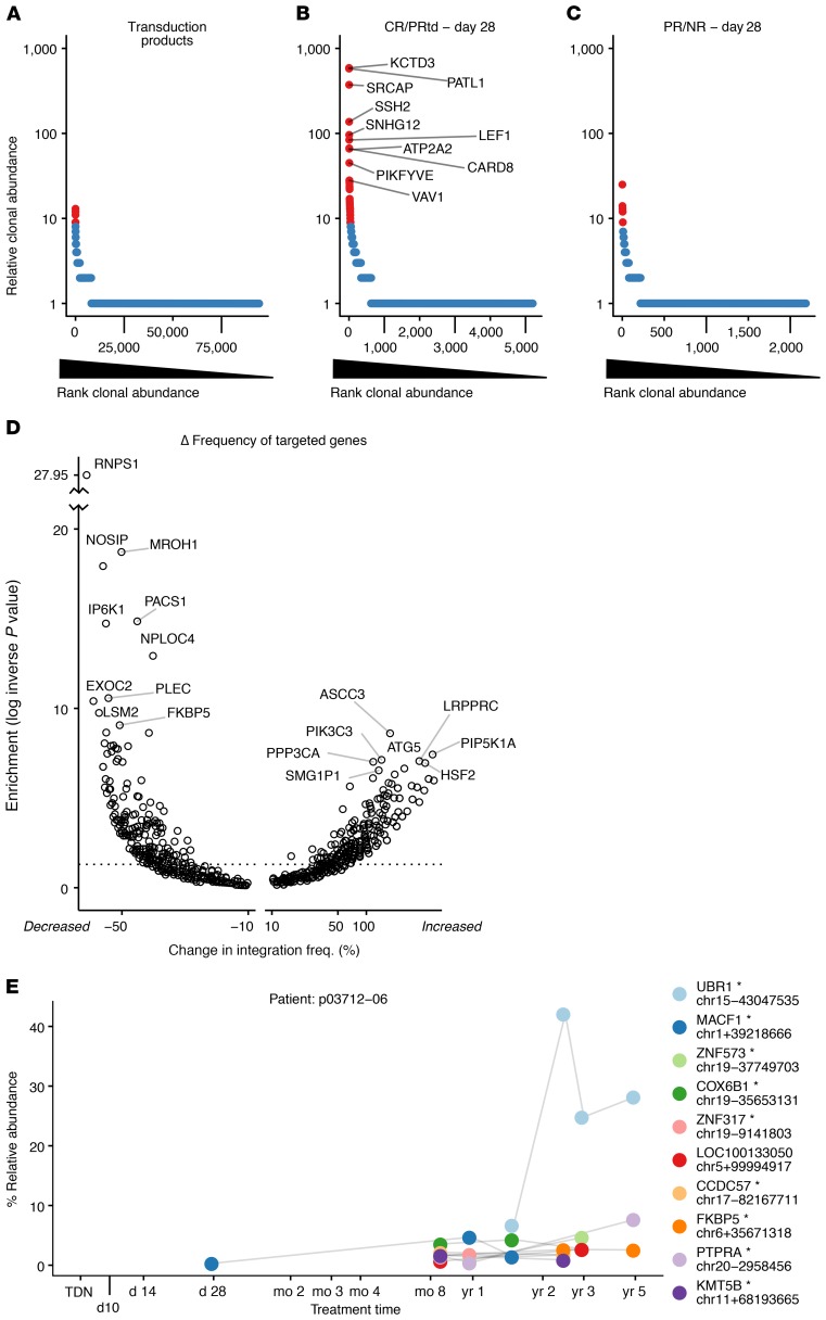
Figure 3. Clonal behavior of CART19 assessed by tracking sites of integrated vectors.
(A–C) Rank-abundance plots summarizing clonal abundance for the transduction products (A); CR/PRtd assayed on day 28 (B); and PR/NR assayed on day 28 (C). Cell clones (identified by identical integration sites) were ordered by most abundant (left) to least abundant (right) as assessed by SonicAbundance (41). Highly abundant clones (red) were scored as the top 1% of all expanded clones, corresponding to at least 9 cells representing each clone. The top 10 most-abundant clones for CR/PRtd on day 28 are labeled with gene symbols. A Venn diagram showing overlap among the top 30 most-expanded clones in A–C appears in Supplemental Figure 2. (D) Volcano plot showing genes where integration frequency was enriched or depleted during growth in patients. The total number of integration sites in each transcription unit was quantified for the preinfusion and posttransplant samples and normalized within each group. The 2 values were subtracted to obtain a normalized percent change (x axis). Fisher’s exact test (corrected for multiple comparisons using the Benjamini-Hochberg method) was used to assess enrichment or depletion (y axis). The x axis shows the percent change in frequency; the y axis shows the inverse log of the P value. (E) Example of a longitudinal expanded clone, from patient p03712-06. The x axis shows the time points sampled; the y axis shows the percent relative abundance of each clone determined by SonicAbundance. The nearest gene and the chromosomal location of each integration site (mapped on hg38) are indicated for the 10 most-abundant clones. The asterisk indicates integrated within the indicated transcription unit. TDN, transduction.

