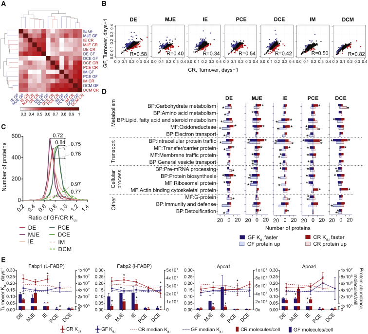
Figure 4.
Comparison of Protein Turnover Rate between GF and CR Mice
(A) Heatmap representing the similarity in global protein turnover rates clustered based on Pearson correlation.
(B) Correlation of GF versus CR protein turnover rates between each sample analyzed. Blue and red dots represent the most significantly changed protein turnover rates (p < 0.1) in GF or CR mice, respectively. R, Pearson correlation.
(C) Distribution of protein turnover rate ratios (GF/CR) before normalizing to 1. Median values are indicated above curves.
(D) Most significantly changed protein turnover rates and abundances at each intestinal location annotated into Panther biological process (BP) and molecular function (MF) terms. The proteins with significantly faster turnover rate (p < 0.1) are given for GF in dark blue and CR in dark red. The proteins with higher abundance (p < 0.05) in GF or CR mice are presented in the light blue or light red boxes, respectively. Asterisk shows significantly enriched terms (p < 0.05). Extended data can be found in Table S2.
(E) Proteins involved in lipid transport. Fabp1, liver-type fatty acid binding protein; Fabp2, intestinal fatty acid binding protein; Apoa1, Apolipoprotein A-I; Apoa4, Apolipoprotein A-IV. Bars represent protein abundance calculated based on MS peak intensity with SD; dots with connecting lines represent specific protein turnover rate and error bars coefficient of variance; dotted lines represent median protein turnover rate of all proteins; asterisk above dots represents protein turnover rate difference of GF versus CR, with p < 0.1 based on Significance A test; asterisk above bars represents protein abundance difference of GF versus CR, with p < 0.05 based on Significance A test. GF, blue; CR, red.

