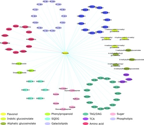
Figure 6.
Metabolic correlation network. The correlation matrix was computed using the R package Hmisc and represented using cytoscape v3.6.1 (Shannon et al., 2003). Nodes represent metabolites and edges represent pairs of metabolites with a Spearman rank correlation above an absolute threshold of 0.5. The node color code indicates the different metabolite classes in the figure. Edge colors represent positive (blue) and negative (red) correlation coefficients between the pairs of metabolites.

