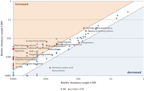
Figure 4.

Scatter plot for biological processes comparing 1D and 2D of sample 1. The mean spectral counts of 2D were plotted against the mean spectral counts of 1D. Significant changes between 1D and 2D were determined by a t‐test. The red colored points indicate a p‐value less than 0.05. The points in the blue or the orange area are at least decreased (blue) or increased (orange) two‐fold. Description of biological processes is based on UniProtKB Keywords for biological processes.
