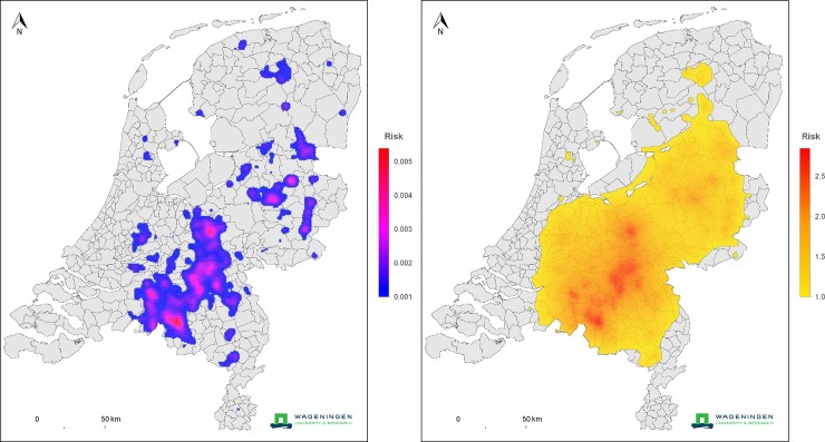
Fig 3. Upper panel: Farm-to-farm transmission risk map, where risk is expressed in terms of a reproduction ratio.
In areas with a risk higher than 1, epidemic spread between farms may occur. Lower panel: infection risk to human residents. At each location the color indicates the potential risk to a Dutch resident at that location, for the worst case scenario that all farms are infected (the 2009 contour map of the Netherlands, source: CBS and de afdeling Geo-informatie van het Kadaster https://www.cbs.nl/nl-nl/dossier/nederland-regionaal/geografische-data/wijk-en-buurtkaart-2009).

