
Fig. 2.
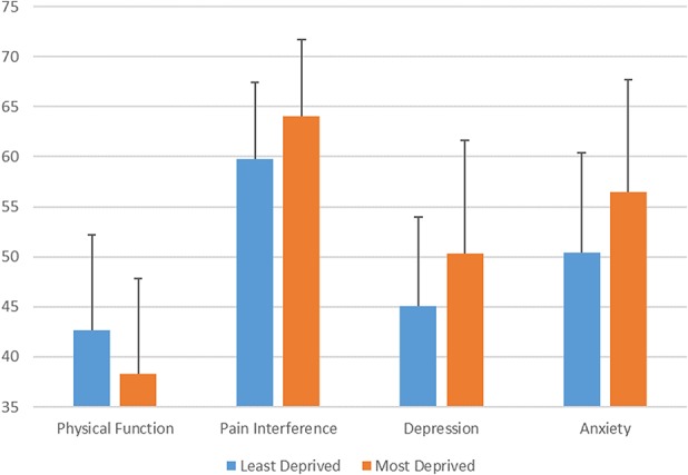
The graph demonstrates the mean PROMIS score for least- and most-deprived ADI quartiles for each PROMIS domain with error bars indicating the SD for each mean. The difference between the mean PROMIS score in patients from the most- and the least-deprived quartile was statistically significant for each PROMIS domain (p < 0.001).