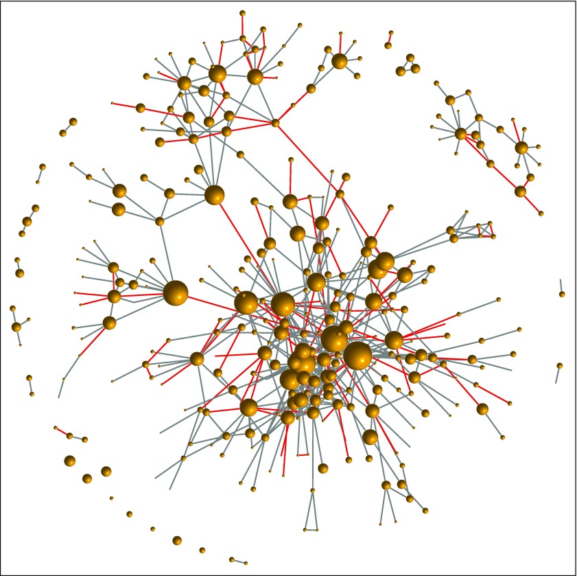
FIG 2.
Example of layering a HemOnc concept onto the mapped regimens. Each vertex in the graph represents a regimen, and edges represent at least one instance of the “Has been compared to” relationship in HemOnc. Node size is proportionate to the number of studies involving the regimen as a comparator (eg, the largest node is docetaxel monotherapy, with N = 118 studies). Edges colored red represent randomized clinical trial comparisons that were the basis of a US Food and Drug Association drug approval or new indication. The HemOnc vocabulary is available to academic and noncommercial users through the CC BY-NC-SA 4.0 license.

