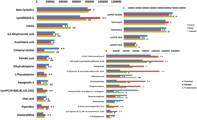
Figure 7.
Heat map analysis of 32 differential metabolites in control group, model group and treatment group rats. Different color marks represent the change degree of relative content and the darker the color, the higher the relative content. Each row represents a metabolite, and each column represents a single sample. *model vs control, p < 0.05; **model vs control, p < 0.01. #Treament vs model, p < 0.05; ##Treament vs model, p < 0.01.

