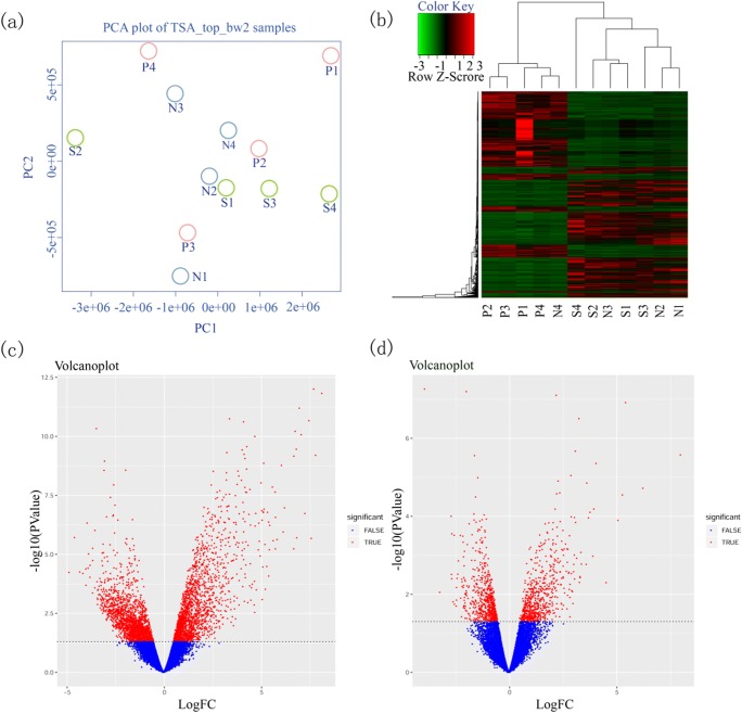
Fig. 1.
a Principal component analysis (PCA) of DEGs. b Unsupervised hierarchical clustering of gene list of 12 samples. x-axis represents samples and y-axis represents the expression abundance of different genes. The color from green to red represents the gene expression abundance from low to high. Volcano plot of differentially expressed genes. c N vs P. d N vs S. The x-axis represented the log2 of fold change (FC) and y-axis represented log10 of p values. Genes with FC > 2 and p < 0.05 were painted as red dots. Red dots on the left were downregulated genes and on the right were upregulated genes. The leftover blue dots were the genes without significant difference

