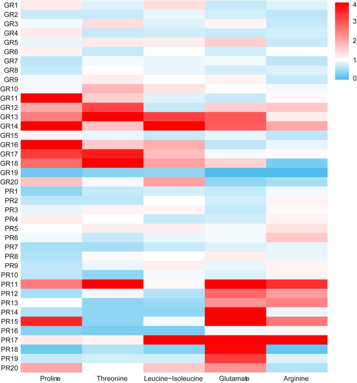
Figure 3.
The heat map of the five different metabolites in the GR and PR groups. The colors changing from blue to red indicate the changes of characteristic metabolite content relative to the average normalized quantities of the metabolites in the GR group, blue plots indicate down-regulated metabolites, and red plots indicate up-regulated metabolites.

