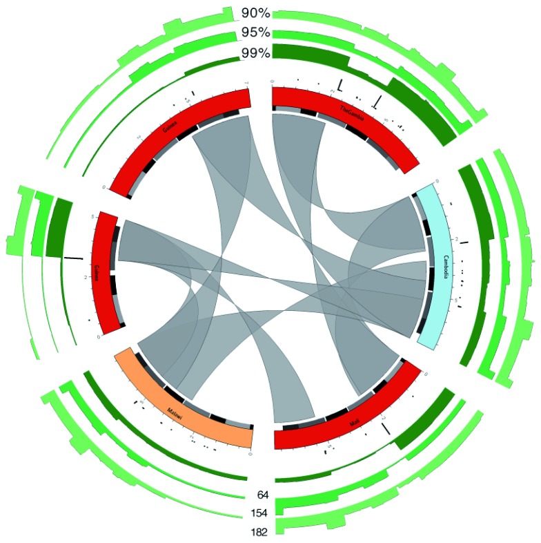
Figure 5. Overview of recombination.
Circos plots of six var genes, taken from the first 2kb OrthoMCL cluster. Genes are coloured based on the geographic location of the isolate from which they were obtained (using same scheme as Figure 3). Alternating grey and black boxes mark the positions of domains. The inner gray ribbons show similarity between the genes with at least 99% identity and ≥ 2 kb overlap. The black bar plots show frequency of detected recombination events using the normalized var gene dataset. The green bar plots show the number of hits over the genes against the normalized dataset, at three different percent identity cutoffs: 99, 95 and 90%. Maximum (y-axis) values are shown against the bar plots at the bottom of the figure.

