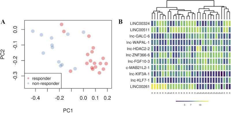
Fig 2.
(A) principal component analysis shows the position of each sample on a bi-dimensional graph. The x- and y-axes represent the first (PC1) and the second (PC2) principal component respectively. Red dots are responder patients, whereas blue dots are non-responder patients as defined in the Methods section. (B) Heatmap plot identifies gene expression patters of 11 lncRNAs in 30 LARC samples. The x-axis represents the class of samples (nr = non-responder, R = responder). The y-axis represents transcript expression. Each cell shows a color that ranges from dark blue to yellow. The darker the blue is, the lower the expression is and vice versa.

