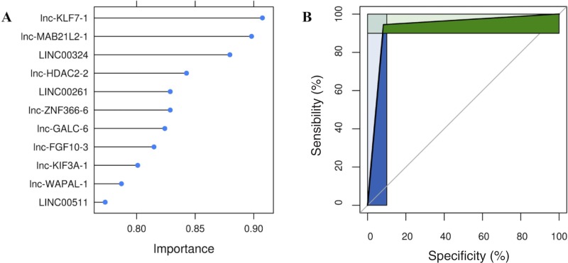
Fig 4.
(A) needle plot of the SVM based on polynomial kernels. The graph shows feature importance calculated determining AUC for each predictor. The ranking allows to assess the minimum number of features to design an optimized simpler classifier. (B) ROC curve shows the diagnostic performance of lncRNAs signature. Green and blue areas represent partial area under the curves (pAUC), corresponding to clinically relevant regions of sensibility and specificity.

