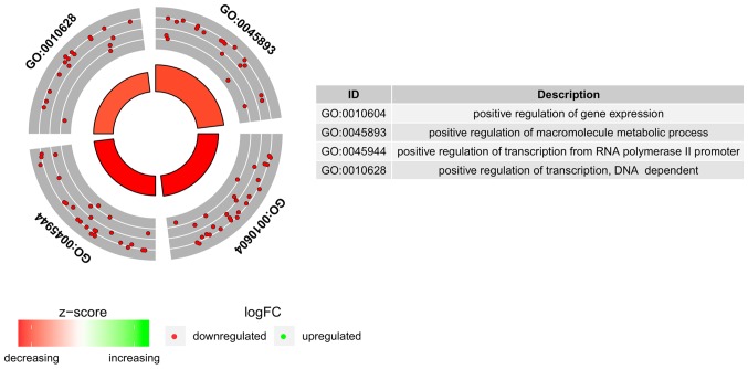
Figure 2.
Circular visualization of gene-annotation enrichment analysis. The outer circle presents a scatter plot for each log FC term of the assigned genes. Red circles indicate upregulation and blue circles indicate downregulation. The inner circle represents the Z-score and the size/colour of the bar corresponds to its value.

