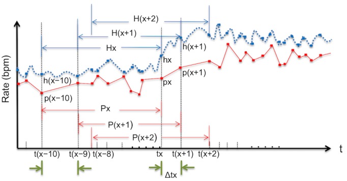
Figure 1.

Schematic diagram of time series curves with matching measurement intervals (Step1). The figure shows the pulse rates (px) calculated on the smart watches and the corresponding heart rates (hx) on the electrocardiographic monitor at each time point (tx) when the pulse rate was calculated. The time interval (Δt) shown on this graph is dependent on the pulse rate measurements. The average of 10 consecutive pulse rates and 10 corresponding heart rates is Px and Hx, respectively. bpm: beats per minute.
