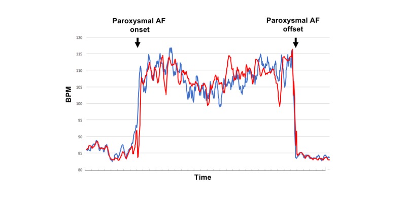
Figure 3.

Time series trend curves during atrial fibrillation (event number 18). The figure compares the trend curve of the Apple Watch W mode pulse rate (red curve) with that of the electrocardiography-based heart rate (blue curve). The 2 trend curves follow a similar pattern and therefore appear almost identical (cross-correlation function 0.83; P<.001). AF: atrial fibrillation; bpm: beats per minute.
