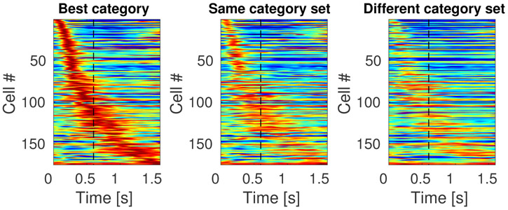
Figure 8. Sequentially activated time cells in lPFC encode time conjunctively with stimulus identity.
The three heatmaps each show the response of every unit classified as a time cell. The heatmap on the left (“Best category”) shows the response of each unit to the category that caused the highest response for that unit, sorted according to the units estimated time of peak activity. The second column (“Same category set”) shows the heatmap for the same units, but for the other category from the same category set as that unit’s “Best category.” For instance, if a unit responded the most on trials in which the sample stimulus was chosen from the cat category, then that units response to cat trials would go in the first column and its response to dog trials would go in the second column. The third column shows the response of each unit to trials on which the sample stimulus was from the other category set. Continuing with our example, a unit whose best category was cat would have its response to car trials in the third column. The scale of the colormap is the same for all three plots and it is normalized for each unit such that red represents the unit’s highest average firing rate and blue represents its lowest average firing rate across time bins.

