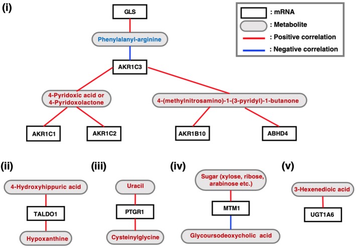
Figure 6.

Correlation analysis between the mRNA abundance (TPM; transcripts per million) and metabolite quantity (relative quantity) measured in the G‐Met analysis with Spearman’s method. White and grey boxes indicate the names of genes and metabolites, respectively. Red and blue lines indicate positive and negative correlations between the mRNA abundance and metabolite quantity, respectively. Metabolites shown in red and blue are those increased and decreased in the culture supernatants of NRF2‐high NSCLC cell lines, respectively
