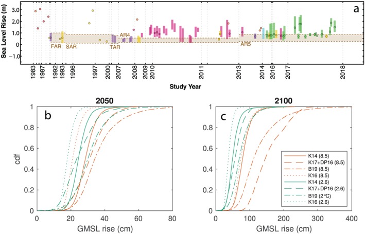
Figure 1.

(a) Evolution of 21st century GMSL rise projections for high‐emissions scenarios. Reproduced from Garner et al. (2018). Bar and point colors correspond to the methodology used by each study: top‐down semiempirical (pink), bottom‐up literature synthesis (red), bottom‐up model hybrid (orange), bottom‐up model synthesis (yellow), bottom‐up probabilistic (green), bottom‐up expert judgment (cyan), other (blue), and IPCC reports (purple). Tan‐shaded regions and dashed lines represent the ranges of GMSL rise from the IPCC reports. (b and c) Cumulative distribution functions of (b) 2050 and (c) 2100 GMSL rise projections under RCP 8.5 (orange) and a low emissions scenario (either RCP 2.6 or 2°C stabilization, blue). Solid, dashed, and dot‐dashed lines represent CDFs of bottom‐up projections using ice‐sheet projections from Kopp et al. (2014) [K14]; Kopp et al. (2017) using the AIS projections of DeConto and Pollard (2016) [K17+DP16], and Bamber et al. (2019) [B19]. Dotted lines represents the top‐down semi‐empirical projection of Kopp, Kemp, et al. (2016), calibrated using the paleo‐temperature reconstruction of Mann et al. (2009) [K16].
