
Figure 21.
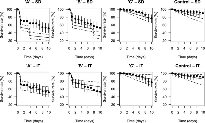
GUTS‐RED‐SD (upper panel) and GUTS‐RED‐IT (lower panel) model validation results on a typical pulsed experiment data set: the survival rate over time is represented as a function of time for each exposure profile (headers of single plots): black dots are the observed survival rates, while the solid line corresponds to the median curve. The dashed lines give the 95% credibility band representing the uncertainty coming from the uncertainty on parameters estimated obtained from the calibration data set