
Figure B.1.
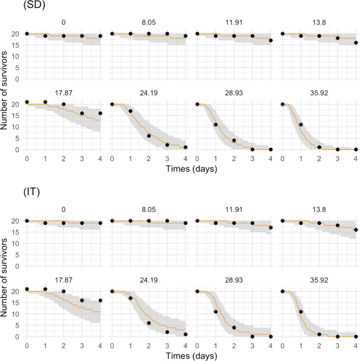
Fit plot of the GUTS‐RED‐SD (upper panel) and GUTS‐RED‐IT (lower panel) model calibration results on a typical acute toxicity test: the number of survivors over time is represented as a function of time for each tested concentration (headers of single plots): black dots are the observed numbers of survivors, while the orange plain line corresponds to the predicted median numbers of survivors. The grey band is the 95% credibility band representing the uncertainty