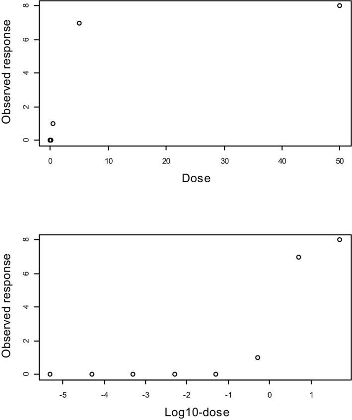
Figure 7.

A dose–response data set where the response is plotted against the dose (upper panel) and against the log‐dose (lower panel). The slope appears infinite when the response is plotted against the dose, while it appears to be ‘threshold‐like’ when plotted against the log‐dose. The lower doses are squeezed to dose zero when plotted against dose, and hence not visible. When plotted against log‐dose they become visible, showing that in reality there is a large range of doses with virtually no effect
