
Figure 3.
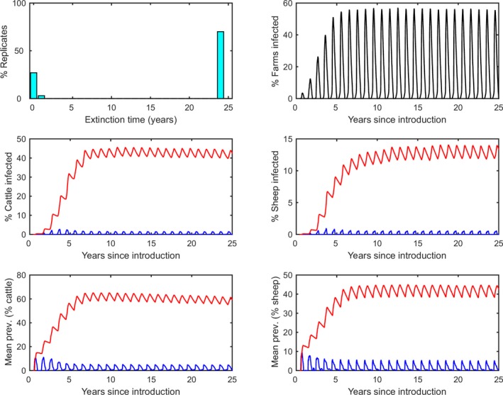
Simulated dynamics of bluetongue virus in south‐east England over a 25‐year period
- Top left: Extinction time (in years). Top right: Time course for the proportion (%) of farms with BTV circulating. Middle: Time course for the proportion (%) of cattle (left) and sheep (right) that are infected (blue lines) or seropositive (red lines). Bottom: Time course for the mean within‐herd prevalence (%) of cattle (left) and sheep (right) that are infected (blue lines) or seropositive (red lines). Each figure shows the mean of one hundred replicates of the model.