
Figure 13.
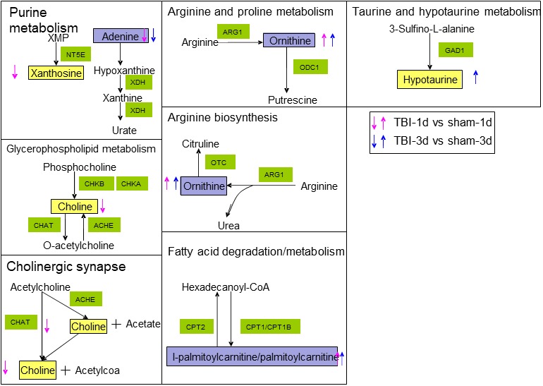
Disturbed metabolites are shown by yellow rectangles. Up arrows show upregulation trends. Down arrows show downregulation. Red arrows represent metabolites that changed on day 1. Blue arrows represent metabolites that changed on day 3. The metabolites indicated with purple color showed changes on both day 1 and day 3