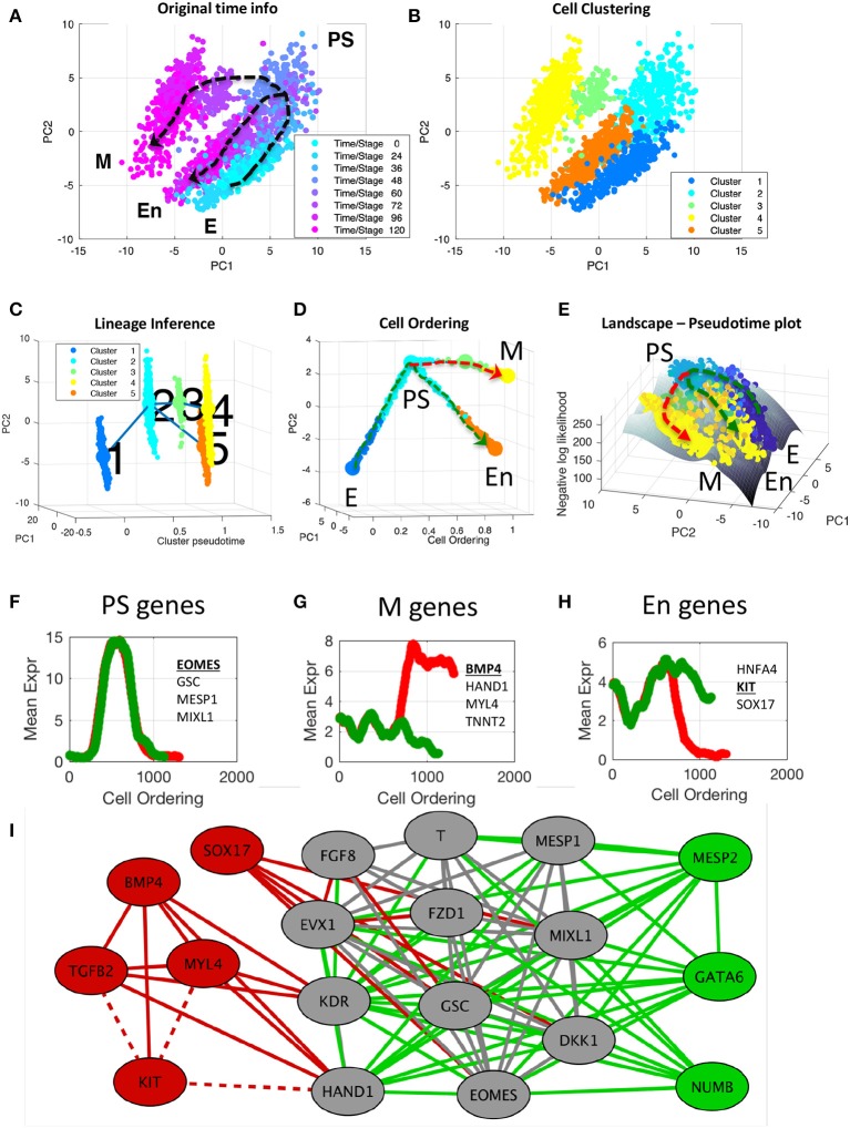
Figure 5.
End-to-end analysis of single-cell transcriptional profiles during iPSC differentiation into cardiomyocytes. The single-cell gene expression dataset was taken from the study of Bargaje et al. (2017). (A,B) PCA plots of single-cell dataset along the first two principal components. Each dot represents a cell, where the colors indicate (A) the capture time info and (B) CALISTA single-cell clusters. (C) Lineage progression graph reconstructed by CALISTA. The graph was generated by adding transition edges in increasing order of cluster distances until each cluster is connected by an edge. Following this procedure, an edge connecting cluster 1 and 5 was originally added in the graph. We manually removed this edge as the edge bypassed intermediate capture times. (D) Pseudotemporal ordering of cells. Cells were first assigned to the state transition edges in the lineage progression, and then pseudotemporally ordered along two developmental paths—mesodermal (M) path (red) and endodermal (En) path (green). (E) Cell likelihood landscape. The landscape shows the surface of the negative log-likelihood of the cells. A higher value thus indicates a state of increased gene expression uncertainty. (F–H) Moving window average of gene expression along M and En developmental paths for representative (G) PS, (H) M, and (I) En genes (underlined and boldfaced). (I) Gene modules of M (red and gray) and En paths (green and gray) [drawn using Cytoscape (Smoot et al., 2011)]. The gray nodes and edges are common between the M and En modules. Solid (dashed) lines indicate positive (negative) gene correlations.

