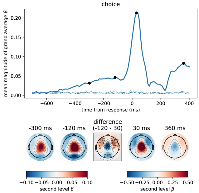
Figure 9.

The button press motor response peaking at 30 ms is represented most strongly in central magnetometers, but the corresponding topography differs slightly from that associated with momentary and accumulated evidence. We computed the correlation between participant choices and MEG magnetometers using linear regression for data aligned at response time. Following the format of Figure 5 we here show the time course of the mean (across sensors) magnitude of grand average regression coefficients (β). Sensor topographies for time points indicated by the black dots are shown below the main panel. Note that for the time points before the response we use a different scaling of colors than for time points around the response and later. This is to more clearly visualize the topography around the response which contains larger values. The color scaling for the time points before the response is equal to that of Figures 5, 6. The topography at –300 ms strongly resembled that for accumulated evidence, but the topography around the response (30 ms) additionally exhibited stronger fronto-lateral and weaker occipital anti-correlations (p < 0.01 corrected, cf. middle difference topography, see Methods for details). Positive values / correlations mean that measured sensor values tended to be high for a right choice (button press) and low for a left choice and vice-versa for negative values.
