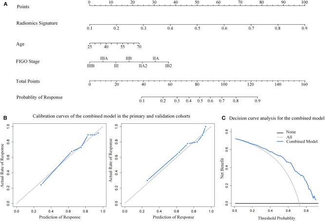
Figure 4.
Nomogram developed with the combined model and calibration curves, decision curve analysis for the combined model. (A) The developed nomogram. (B) Calibration curve of the combined model in the primary and validation cohorts. The middle gray line represents a perfect prediction. The blue line represents the performance of the combined model. Better prediction is demonstrated by a closer fit of the blue line to the grayline. (C) Decision curve analysis for the combined model. The y-axis depicts the net benefit. The blue line represents the combined model. The grayline represents the assumption that all patients have response of NACT. The black line is the opposite.

