Figure 1.

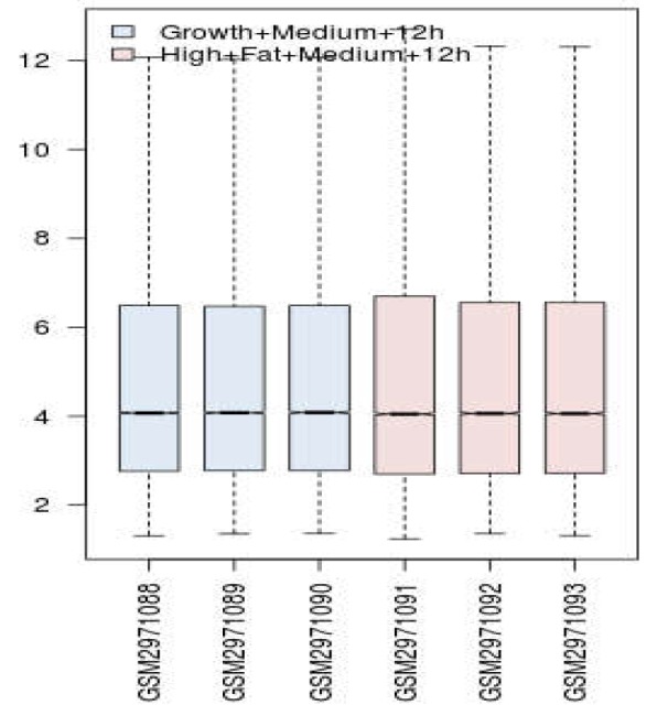
Distribution of gene expression values of samples represented by boxplot analysis; Blue and red refer to control and high fat treated groups. Profiles are median center and are matched statistically

Distribution of gene expression values of samples represented by boxplot analysis; Blue and red refer to control and high fat treated groups. Profiles are median center and are matched statistically