Figure 1.
Overview of the PLASMA Method
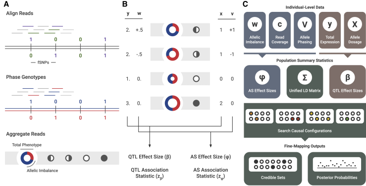
(A) Pre-processing of sequence-based data. First, reads are mapped to the sample’s genotype. Reads intersecting markers are colored. Then, the sample’s genotype is phased. Reads intersecting heterozygous markers can then be mapped to a particular haplotype. Lastly, reads across the locus are aggregated in an allele-specific manner. To visualize this data, the expression is represented by a ring chart, and the genotypes by pedigree symbols. In the ring chart, the diameter signifies the total read count, and the colors signify the proportion of reads coming from each haplotype. For the pedigree symbols, a white circle signifies a wild-type homozygote, a shaded circle signifies an alternative homozygote, and a half-shaded circle signifies a heterozygote. In heterozygotes, the direction of shading corresponds to the direction of heterozygosity (phasing).
(B) Visual representation of QTL and AS statistics under a single causal variant, where the alternative allele increases expression. The total expression (y) is determined by the allelic dosage (x), whereas the allelic imbalance (w) is determined by the phasing (v). These two sets of data are used to calculate QTL and AS association statistics ( and ).
(C) Diagram of PLASMA’s fine-mapping process. First, QTL and AS statistics are calculated from read data. Then, these statistics, along with an LD matrix, are used to generate probabilities for causal configurations. By searching through the space of these causal configurations, the model produces credible sets and posterior probabilities for each marker.

