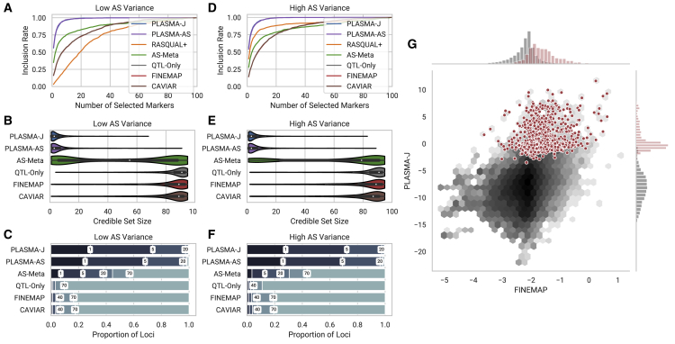
Figure 2.
Comparison of Fine-Mapping Methods on Two Sets of Simulated Loci of 100 Markers and 100 Samples Each
These two sets differ in the variance of the AS phenotype, but with a fixed mean coverage and AS heritability.
(A and D) Inclusion curve at low and high AS variance, respectively (0.6, 0.8 standard allelic deviation). The y axis shows the expected proportion of markers included in the credible set, and the x axis shows the number of selected markers by posterior probability.
(B and E) Distribution of 95% confidence credible set sizes at low and high AS variance, respectively.
(C and F) Proportions of loci with 95% credible set sizes within given thresholds at low and high AS variance, respectively. Thresholds used are 1, 5, 20, 40, 70, and 100 markers.
(G) A per-snp fine-mapping comparison between PLASMA-J and FINEMAP across 500 simulated loci with one causal variant each. The axes denote the posterior log-odds of causality for FINEMAP and PLASMA-J, respectively. The black hexagons represent the joint distribution of all markers, while the red dots represent specifically the causal markers. Univariate histograms for PLASMA-J and FINEMAP are plotted along the margins.

