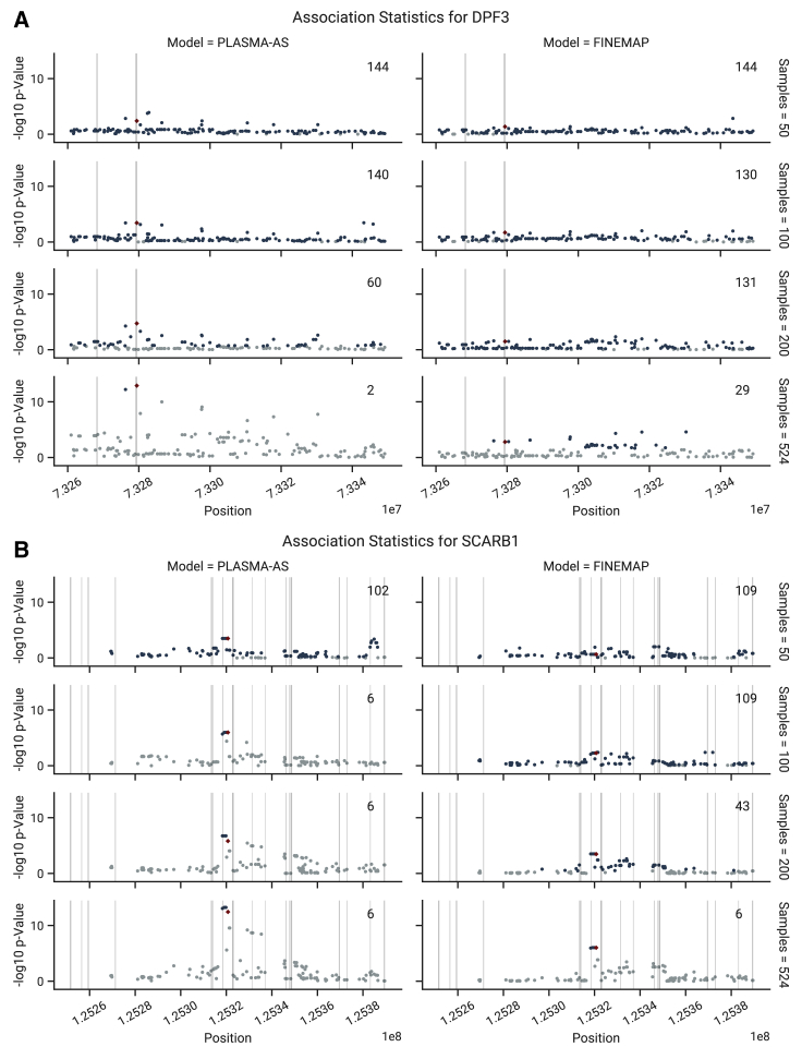
Figure 6.
Comparison of AS and QTL Associations in the Experimentally Verified Loci, as a Function of Sample Size
Regions of 70 kb are shown around the causal marker. AS and QTL p values were calculated using from and , respectively. Fine mapping was conducted with the PLASMA-AS and QTL-Only models, respectively. 95% credible set sizes for the whole locus are displayed in the top right of each subplot. Markers in the 95% credible set are shown in dark blue, while markers not in the sets are shown in light blue. The experimentally verified causal marker is shown in red. Regions of open chromatin (DNase-seq peaks) are shaded in gray.
(A) Associations in the DPF3 locus.
(B) Associations in the SCARB1 locus.

