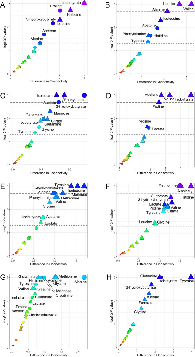
Figure 4.
Difference in terms of connectivities in networks of survived and deceased are reported against each metabolite’s P-value for each risk class. The thresholds for significance at 0.05 and after Bonferroni correction are reported. The colors red to blue encode for the increasing difference. Significance in terms of metabolite levels is also reported: circles are metabolites that are statically different between survived and deceased patients, whereas triangles encode for the not significant ones. (A) NSTEMI (low risk); (B) STEMI (high risk); (C) low risk for GRACE score; (D) high risk for GRACE score; (E) Killip class I (low risk); (F) Killip class II-II (high risk); (G) low risk for NOESY RF score; (H) high risk for NOESY RF score.

